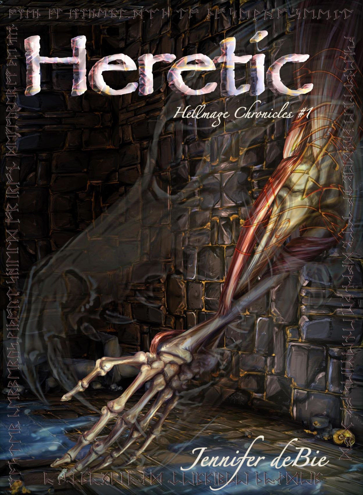
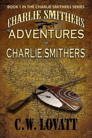
We have a cover, and isn’t she a beaut?
Feel free to stop for a minute and soak it up, click over here to the new Hellmage Chronicles homepage, and here to read the first chapter, then scroll down further for the cover’s full story.
Cover design is a tricky thing.
Cover design with one of your oldest friends, an incredible, detail oriented artist is… a process.
It started with a conversation over breakfast a couple of days after the publisher accepted the manuscript, and then sending said manuscript to the artist for perusal.
Then there was the brainstorming and the inspiration hunting and the research stage. Does the publisher have a kind of unified “house style” across their covers (no), is there anything from our own lives, backgrounds, or personal experiences that we’d like to incorporate (sorta?), and how much do we know about anatomical illustrations (a lot)?
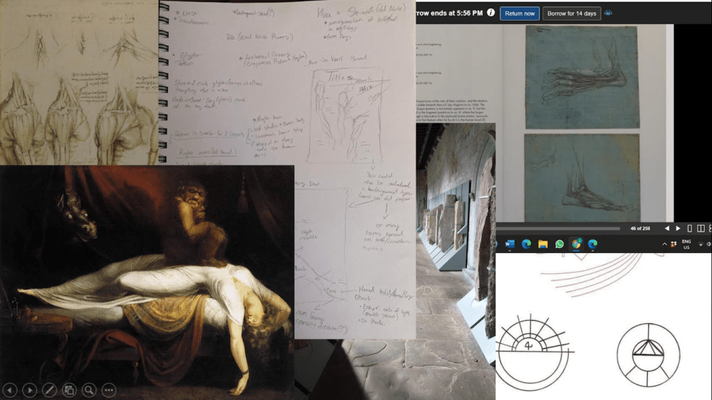
Inspiration hunting took many forms, and in the fun little montage to the left keen eyed readers will find Bronze Age ogham stones in a corridor at University College Cork, a few examples of DaVinci’s 15th century anatomical illustrations, Henry Fuseli’s 1781 painting, “The Nightmare”, drawings from Hayao Miyazaki’s 2004 film Howl’s Moving Castle, and the notes taken by my patient, lovely artist during the course of our first conversation.

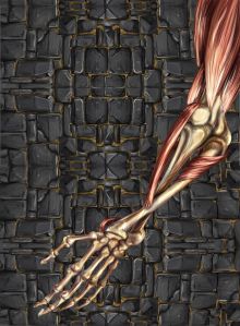
Then there was the moment when I decided that I could do the cover myself and sent this picture >>
And then we had a good giggle over that silly notion and got down to work.
I say that like I had much to do with this process beyond being Hope’s eternal cheerleader and mostly agreeing that her ideas are awesome.
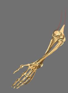
We started with the arm. We knew we wanted a flayed arm (it’s relevant to the story, I promise) and early on the thought was that it would be on parchment. A dissected arm on parchment with lines running to it indicating various features and describing them, sometimes in English, sometimes not.
Like the second gnarliest anatomical illustration ever. DaVinci gets first prize in that category, obviously.
But then we remembered this series, also published by my publisher, and worried that the parchment might make it a little too matchy-matchy.
If we were going to make a gory cover, then by gawd it wasn’t going to be a samey looking gory cover!
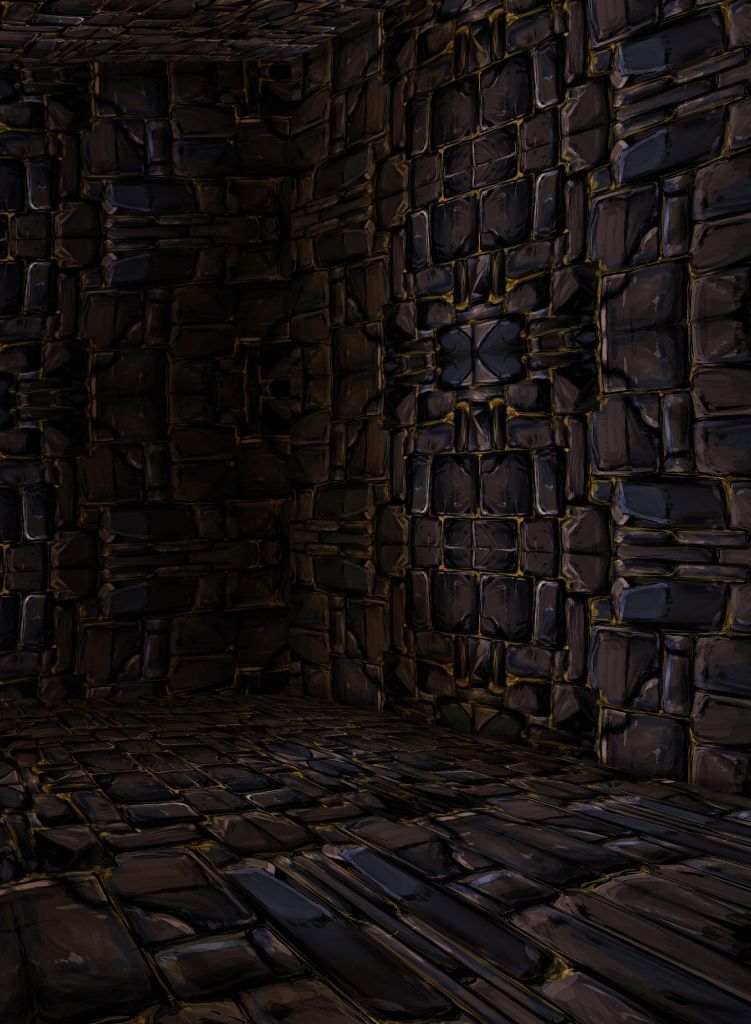
So that’s where the stone came in, and the idea of laying the arm against a crumbling wall. Hope played with it, as she does, and came up with this stone pattern and flipped it around and replicated it a few times and my, poor, innocent soul said That’s Awesome! The Wall Can’t Get Any Better Than This!
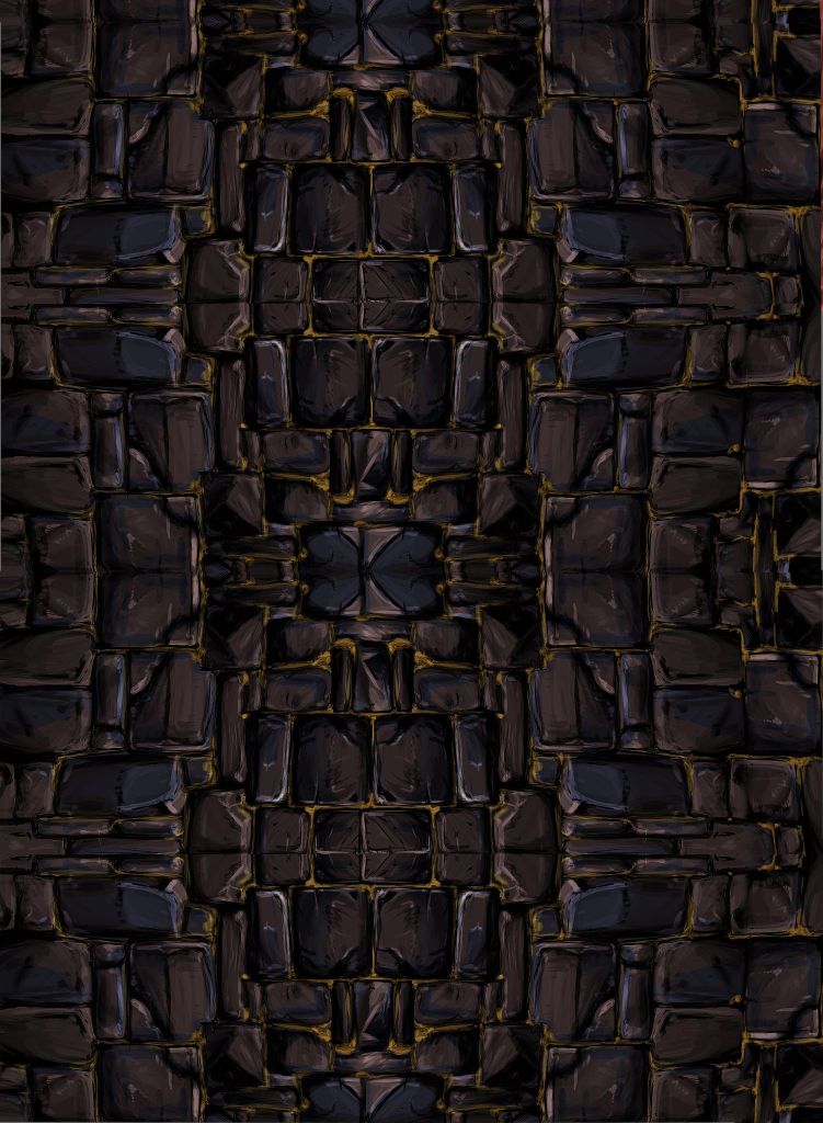
Sweet, summer child in all her naivety. This is why I write the stuff, I don’t draw it, because no sooner had I said that then Hope told me she wanted to add some dimension and make the replication a little less obvious, so she played around and turned it into a room instead of a single wall.
What?
The audacity!
The Excellence!
Why didn’t I think of that?
I don’t think of these things, obviously. That’s why cover design is a project for the experts, not the authors. Obviously.
So we have our background.
Some of it anyway, we’ll circle back to it in a bit.
What about the arm?
For literal months my dear, patient friends and family have been shown a litany of slowly developing, skeletal arms and told to get excited about them.
Bless them, looking back, I get how hard it was to get excited by these.
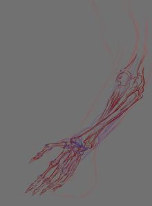
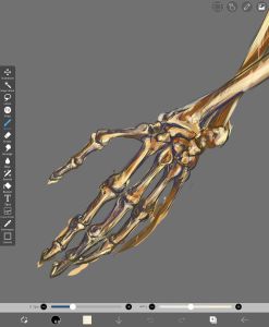
“Yup, that’s an arm” was the general consensus, and they were right. It was indeed an arm. No arguing with that. But it’s what the arm would become, you see.
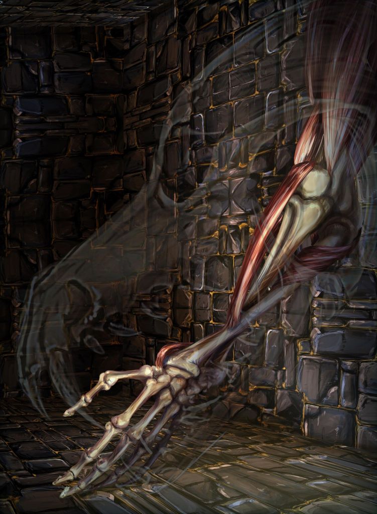
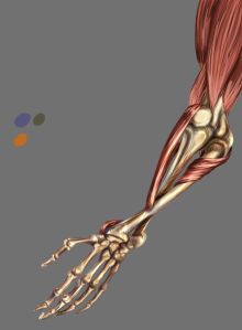
First there was the simple marriage of the room and the arm and a cool wolf skull Hope decided to throw in because why wouldn’t you throw in a wolf skull?
Again, there is thematic relevance, I promise!
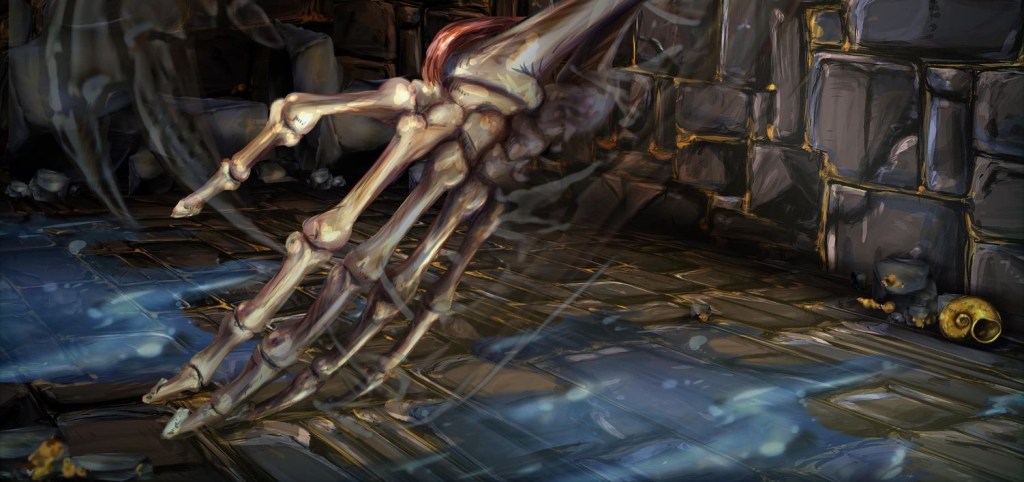
Then there was adding details to the room ’cause it still felt like a big, empty, rock room, with nothing going for it but a ghostly skull and an a flayed arm.
The water was my idea, because I was an active participant in this process and not just a cheerleader.
At least that’s what I tell myself at night before going to sleep.
Then it was titles and type and choosing just the right font, and version of that font, and how big it should be and where exactly it should go.
Let’s just say that I, and my office mates, and podcasting friends, and a few random strangers have all seen many, many variations on the font and leave it at that.
So we’re to here:
And the title isn’t quite popping the way it could, but that can be fiddled with later, because now we’re playing with details.
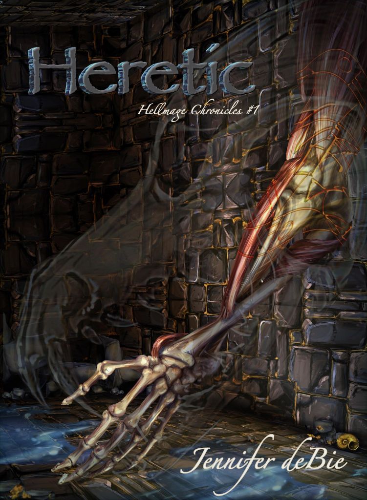
These markings called glyphs are important to the version of magecraft that I have created for my novel, so now we’re playing with glyphs.
Or, Hope’s playing with details.
I looked at this version of the cover and said, That’s incredible! It can’t get any better than that! You’re the best Hopey!
Startling naivety, yes, that is today’s theme.
I’ve got a soft spot for the asymmetrical, but circular glyphs used in Howl’s Moving Castle, so Hope, (my genius) comes up with a few because she’s awesome and that’s just that.
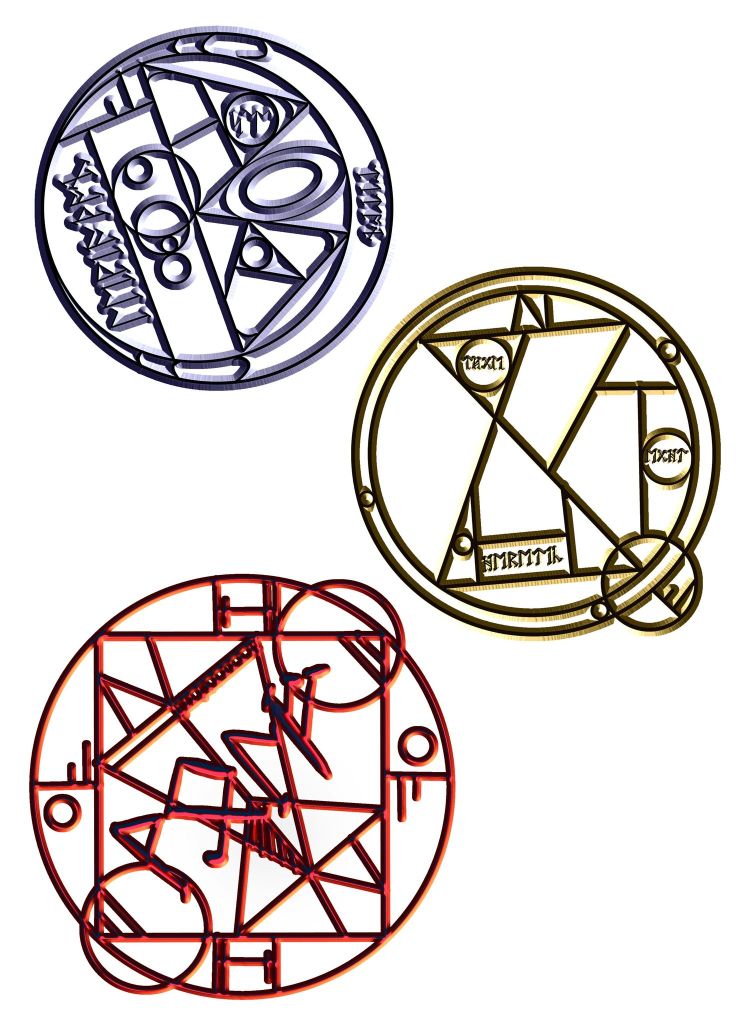
What do they mean? What do they do? You’ll have to read the book and find out, for now can we just appreciate the artistry?
Then she does some fiddling with Norse and Anglo Saxon runes and decides to run a runic conversion on a few key words and tricky phrases from the novel, and that’s how we end up with this version of the cover.
It’s been months and hours and a saga of an editing process, (for both of us because I’ve been working on my proof copy during a good chunk of this)
and I look at this and tell myself Surely, it can’t get any better than this.
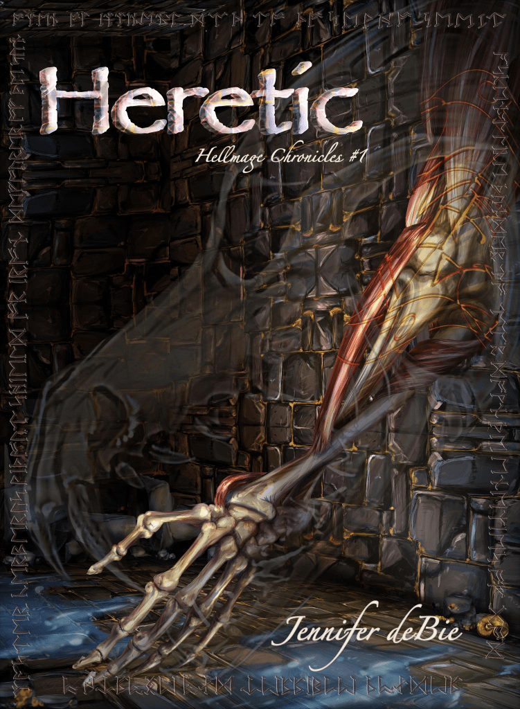
But it can, and it did because someone with a keen eye, or a zoom in feature, will find a few more subtle background details and easter eggs from our intrepid artist.
Even I don’t know all of them, but scroll back up to the top of this post and squint at that cover and you might just find a few.
So that’s it.
That’s how we did it!
And remember “we” here is a very generous way of phrasing that, because I didn’t do much besides be consistently astounded and enthralled by every stage of the process.
But Jenni, When Will It Be Published?!?
Welp…
This morning (March, 29th, 2022) Wild Wolf Publishing said “within the week”.
So before next Tuesday?
When you publish digitally, things can move quickly once there’s a cover.
So you keep an eye out, and I’ll put an ear to the ground, and when there’s something to buy, you can bet I’ll be there to tell you where, how, and how much.
Until then, thank you again to Hope for her incredible work, thank you to the patient friends who have been subjected to streams of arms and fonts, and thank you to everyone who decided to read this far down the blog post.
Chase thunder,
JdB

Jenni: This is so fascinating – to have an inside look at all that publishing a book entails. Can’t wait to add this to my Jenni collection! Joann
LikeLike
Thank you, Pappy!
LikeLike